


GetBusy’s specialist software solution enables companies to work securely and efficiently with their customers, suppliers and teams anytime and anywhere. The platform provides useful communication, file sharing and team collaboration tools and can be easily integrated into other applications.
The challenge
Founded in 1991, Maintel has a strong reputation for being solid and dependable. However, its brand was outdated and needed to reflect its role as a key enabler in its customers’ businesses.
Our solution
Our first step was to gain a deep understanding of Maintel’s brand, how it’s perceived and the future direction of the business. We did this by carrying out a series of workshops with the senior management team.
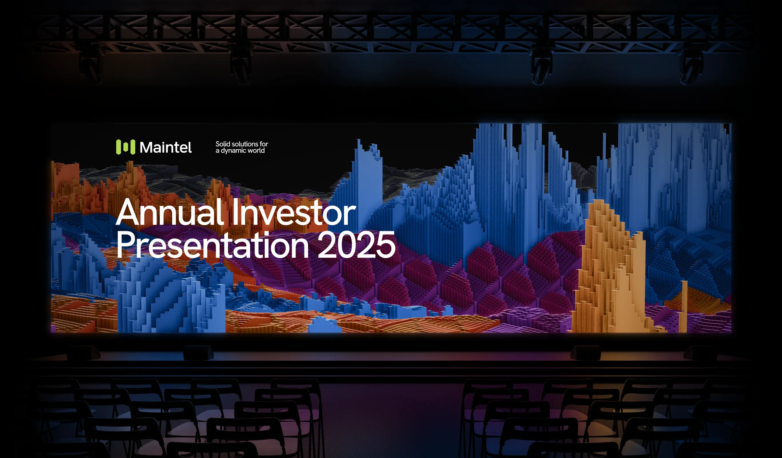
The resulting insights allowed us to reposition Maintel from a provider of cloud and managed communications services to an enabler of meeting and exceeding the ever-changing needs and expectations of customers, employees and the general public in a demanding, dynamic world. This led to the creation of a new strapline, ‘Solid solutions for a dynamic world’.


The new brand framework that followed sets out Maintel’s new brand narrative, incorporating its brand truths, brand personality, value proposition, positioning statement, elevator pitch, purpose, vision and behaviours. It also informed the new brand identity, the concept for which was live data feeds to convey both the dynamism and speed of Maintel’s service offering as well as the dynamic world in which Maintel operates.
The result
Maintel now has a bold and sophisticated visual and verbal identity that is aligned with its future ambitions. We implemented the new brand across several channels, including a brand film, employee and investor presentations and its 2024 Annual Report.
We were also consultants and brand guardians for Maintel’s new website.
The CEO invited the company’s 500 employees to a number of Everyman cinemas to share the brand film and launch the new brand.
Credit:
Data art and brand asset tool in collaboration with Variable


The challenge
As the primary brand presence and key channel for lead conversion, the website faced a threefold challenge. It needed to effectively communicate Planet Mark’s refreshed brand, purpose, vision, and service offerings, empower the team with the ability to easily update the site, and optimise its role as a powerful lead generation and conversion tool.
Our solution
We began with an in-depth planning phase that led to the development of detailed wireframes and an optimised user journey. This guided users toward the Planet Mark programme most relevant to their needs — whether business, buildings, Net Zero, Scope 3, or supply chain. The site's extensive content was reorganised to emphasise key benefits and present a clear, phased approach for each programme.
Additionally, the user journey was streamlined to simplify navigation, making it easy for users to access helpful resources, such as learning about the Planet Mark community and discovering upcoming events.
We worked closely with the team to implement their new visual identity on the website. This included helping to define a photographic style for the site, as well as maximising the full suite of visual assets.


The result
The new website marks the first iteration of Planet Mark’s refreshed brand, featuring a modern, clean design and an optimised user journey that makes navigation easier for visitors.
As a powerful marketing tool, the site is designed to drive revenue through lead generation, brand positioning, and enhanced awareness and amplification. With extensive SEO capabilities and seamless integration with HubSpot, the site is fully equipped to optimise and measure digital marketing campaigns.


The challenge
We understand the importance of compelling investor communications for companies experiencing growth, which is why we took charge of creating all the necessary materials for Hansa's first Capital Markets Day.
Our solution
Our comprehensive services involved collaborating closely with the team to effectively convey Hansa's strategy, development technology platform, and vision for future expansion. We consolidated all of this information into a detailed investor presentation, ensuring a cohesive and impactful message. Additionally, we provided valuable advice on content, best practice and design layouts for their annual and sustainability reports.

The result
Recognising the fast-paced growth and development of our client, it was important that we took an agile approach to brand-building communications. To address this, we developed a comprehensive set of updated brand guidelines. This included a complete revamp of Hansa's verbal narrative and messaging, ensuring the company's communication aligns with its evolving identity. Furthermore, we refreshed Hansa's visual assets, which have been successfully integrated into its website, investor communications, and corporate presentations.

The challenge
When the company changed its name and visual identity, we worked with the team on producing a new corporate website.
Our solution
The new site showcases ME Group's refreshed brand identity in an engaging, consumer-led format.
The visual articulation of the brand is supported by compelling narrative content which highlights the company’s key investment priorities and how the value chain delivers long-term growth. ME Group’s commitment to sustainability is also at the core of the new site.


The result
As part of our remit to up-scale the company’s digital communications, we also created a new careers hub for potential candidates. The portal further promotes the new brand identity and vision, as well as using advanced back-end technology to help filter candidates in order to make the job of human resources that much easier.


We also support ME Group on their investor communications and for the past six years we have designed and produced their year-end annual reports as well as advising them on content strategy and best practice.


Over the course of four years, we have collaborated closely with Chubb, assisting them in effectively communicating and engaging with their internal audience, while providing comprehensive support for their marketing communications. As part of our responsibilities, we were tasked with producing an animated film for an internal Diversity and Inclusion campaign. The animation aimed to inform and educate staff about the significance of D&I, while directing them to an online training module.


In order to foster a culture of collaboration and empowerment, we devised an employee recognition program in the EMEA region. This unique initiative allowed every employee to highlight their colleagues who they believed should be recognised for their outstanding contributions to the company. Departing from the traditional top-down approach to appraisals, our goal was to encourage employees to provide their own feedback on their teammates. To support this initiative, we provided strategic guidance, developed impactful messaging, and designed a range of campaign materials including animations, digital banners, posters, interactive forms, diploma certificates, and promotion across the Chubb intranet.


In the challenging year of 2020, Chubb sought to convey an end-of-year message to all of its employees that would be uplifting and acknowledge the incredible dedication and effort exhibited by everyone. As a result, we created an animated film that depicted the journey of a fictional character, capturing his experiences during lockdowns, remote working, homeschooling, and even the influence of TikTok. The film served as a tribute to the resilience and adaptability demonstrated by Chubb employees throughout the year.
Through our collaborative efforts, we have supported Chubb in fostering a culture of effective communication, empowerment, and recognition, ensuring that their workforce remains motivated and engaged.


The business had progressed significantly since being established and the need to enhance the company's suite of communications had become apparent. However the client had one caveat, ‘do not touch the logo.’ Companies often develop an emotional attachment to their identity; however it was clear that the Ellipses brand had lagged behind their operational progress and the scope of the project quickly expanded from polishing to reconstructing.
To ensure informed and effective creative decisions, we conducted a thorough audit of Ellipses Pharma's verbal and visual brand assets. The objective was to assess their appropriateness for the target audiences and their alignment with the company's strategic objectives. Crucially, this process involved engaging key employees, allowing their practical needs and perspectives to shape the scope and purpose of the evolved communications. The result was a unified sense of purpose across the organization.
Through our collaborative efforts, we developed a newly crafted narrative articulation that empowered employees to effectively communicate Ellipses Pharma's unique proposition. This refined messaging enabled clearer and more impactful communication with target audiences, fostering engagement and understanding.

In addition to the narrative, we created a distinct brand identity and a set of visual assets that set Ellipses Pharma apart from its pharmaceutical peers. These assets not only aligned with the company's mission but also reflected its evolved positioning in the industry. The refreshed brand identity and visuals helped differentiate Ellipses Pharma and enhance its credibility and visibility.
By improving their communications and revitalizing their brand identity, Ellipses Pharma successfully positioned itself as a prominent player in the field of cancer treatment discoveries. The improved engagement and differentiation from their pharmaceutical peers propelled them closer to their goal of optimizing resource allocation and accelerating breakthroughs in cancer treatments.

It was important that we really understood the company’s DNA. Through a detailed briefing session, we established a clear strategic platform. The visual identity and company website had not evolved with the business and required a fresh approach.


We leveraged the 3D molecule theme throughout the new brand, as well as using striking portraiture to emphasise the significance of their stakeholder relationships. The end result was a new brand identity, tone of voice, logo-device and digital presence which truly reflects Masters’ core services as well as reinforcing their commitment to sustainable partnerships.


We used a lot of human impact photography to portray what is at the heart of Masters, what moves them. For more scientific content, we created second-tier photography. To help them support communications around new developments and drugs.
The challenge
Our objective was to develop a new, modern and vibrant logo, visual identity and website that effectively blends with the company's rich heritage.
Our solution
It was essential that the verbal and visual articulation of the brand effectively communicated the company's distinctive value proposition. To achieve this, we implemented an impactful and easily recognisable photographic style that utilised the corporate colours. This approach imbued the brand with a clear sense of direction and perspective.

The result
The end result is an easy-to-implement yet dynamic and striking brand identity that gives real weight to the company's digital presence.


As part of the strategic re-positioning process, we conducted a comprehensive evaluation of Befesa's verbal and visual brand. The updated messaging was complemented by a new set of brand assets and guidelines, which showcased a distinctive visual identity. Striking on-site photography was combined with bold red and white typography and iconography, creating a visually impactful presence.


The revamped company website served as the primary activation point for the new brand. We implemented a vastly improved user interface, ensuring that Befesa's diverse range of stakeholders could easily access the information they needed. The website placed greater emphasis on the company's value proposition and business model, while also introducing a dedicated sustainability section that provided a comprehensive view of Befesa's approach to environmental, social, and governance issues.


To effectively communicate Befesa's corporate story, we produced a compelling three-minute corporate video. Collaborating closely with the client, we developed the script and storyboard, and filmed on location in Bilbao. The video seamlessly blended real footage of Befesa's workers with relevant stock footage, illustrating the complete value proposition from aluminium and steel recycling to the final product. By highlighting Befesa's vision and strategy, the video effectively showcased the company's pivotal role in the circular economy.


Recognising the importance of investors as key stakeholders, we integrated the new brand into Befesa's latest annual report and accounts. The report featured impactful full-page imagery of Befesa's operations and employees, ensuring an engaging visual experience. Detailed infographics brought the value chain and production process to life, providing a comprehensive understanding of Befesa's operations.


In addition to the Annual Report, we also designed and produced Befesa's inaugural ESG progress update. To initiate the process, we conducted a meticulous materiality assessment, which guided the content and structure of the report. The narrative content was complemented by visually engaging imagery and infographics. The end result is a fully interactive PDF that has been thoughtfully crafted with an online-only perspective in mind.


The challenge
Our brief was to capture the essence of this brand and develop a captivating and engaging visual identity, which we then incorporated into a new company website.
Our solution
To create a recognisable logo that would resonate with our target audience, we merged the letters ‘p’ and ‘v’ from the Penvale name. This instantly identifiable logo became the focal point of the new visual identity. Complementing the logo, we opted for a monochromatic colour palette, allowing the vibrant and aspirational lifestyle photography to truly come to life.


The result
The end result is a sophisticated brand identity and website that radiate positivity, warmth, and energy.


We helped the company develop a reporting framework post IPO to communicate Adevinta’s global marketplace proposition and brand to its new investor audience.
The challenge
Our objective was to create an engaging inaugural annual and sustainability report that would showcase the expertise of this global marketplace specialist.

Additionally, Adevinta entrusted us with the task of promoting its newly articulated 5-year strategy to internal stakeholders.
Our solution
Our approach involved presenting the strategy through the concept of a marketplace, a space that has played a pivotal role in the development of economies, cultures, and societies throughout history.
To achieve this, we created an interactive animation that simulated a virtual Adevinta world, providing employees with a navigable journey through the marketplace. Throughout the experience, key aspects of the company's strategy were highlighted and explained in detail.
The result
The interactive nature of the animation proved to be highly effective in engaging and educating the intended audience. By immersing themselves in this virtual environment, employees gained a deeper understanding of Adevinta's strategic vision.
Despite the potential of their offering, GetBusy faced a challenge in attracting the right audience. Our primary objective was to redirect prospective customers to download the product demo, generating new business opportunities and active leads
To achieve this goal, we devised a top-of-funnel social media campaign designed to captivate and engage potential leads, driving them towards the product demo. Collaborating closely with GetBusy, we developed compelling messaging and visually appealing designs for static and animated posts and stories across Facebook, LinkedIn, and Instagram. The campaign employed on-brand, playful graphic elements accompanied by witty and engaging strap-lines, ensuring the language resonated with the target audience. We crafted a series of five advertisements, each highlighting a unique feature or advantage of the product. The consistent visual style and concise strap-lines fostered strong brand awareness and recognition throughout the entire campaign.


